Data Points Studio
This website is hosting various data visualization projects/notebooks. The list of currently accessible projects/notebooks is below.-
Sentiment of Twitter users on COVID-19
October 13, 2020
The dataset of the geospatial analytics project includes CSV files that contain IDs and sentiment scores of the tweets related to the COVID-19 pandemic. The model monitors the real-time Twitter feed for coronavirus-related tweets using 90+ different keywords and hashtags that are commonly used while referencing the pandemic.
Only the tweets with exact geo-location are considered, with the following color codes for the sentiments of the tweets: Red (Negative), Green (Positive) & Orange (Neutral)
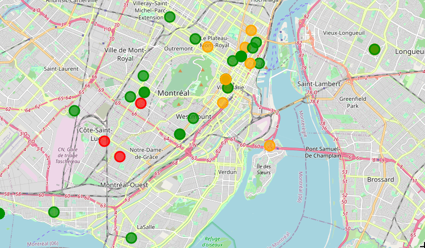
A screenshot of the global, interactive map, zoomed into Montreal, Canada Global Interactive Map (29 MB)
Original dataset collection (tweets) and sentiment scoring by Rabindra Lamsal, with the dataset published on IEEE DataPort.
Ester Cen Chen is the main developer of this Jupyter Notebook and a contributor to its design and maintenance website. Reach out to her via her personal website or LinkedIn Profile. The notebooks containing the full pipeline, leading to the above map, are in Ester’s GitHub repo.